Advance
Amazon Rebrand
Tools Adobe Illustrator + InDesign + Xd // Goal Rebrand a company with a new identity that represents diversity, equity, and inclusion
I designed the imaginary rebranding of Amazon into Advance: the world’s most customer-centric e-commerce company. This challenged to me to translate new company values into brand identity across web design, digital marketing, and print materials.
Logo Design
The name Advance expresses the important of moving forward with new goals for a progressive future with its users.
The primary color, trust, is a deep purple that balances the brighter secondary colors to establish a dependable relationship with customers.
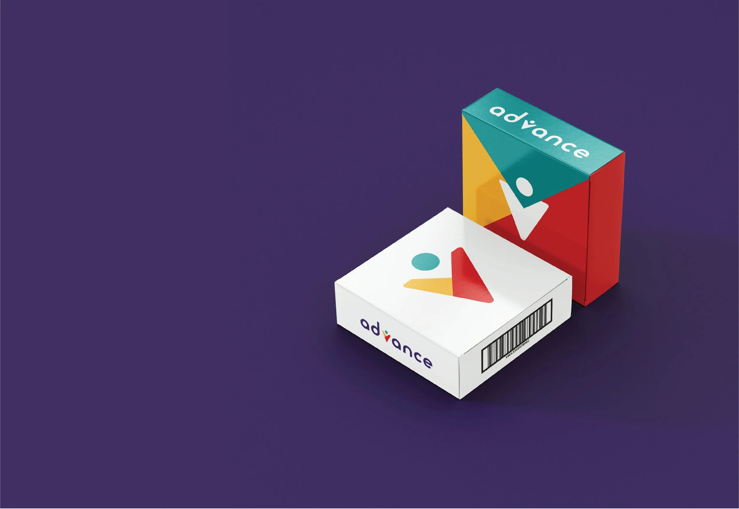
The three secondary colors morning air, dandelion, and firetruck are represent the companies most important values: diversity, equity, and inclusion. They combine to create the tri-colored icon within the logo to show Advance incorporates these principles closely into their business operations.
The brand maintains a friendly tone with a typeface that has smoothed circular edges.

Shapes & Icon
Icon can be broken down into shapes that will serve as unifying graphics in marketing materials.

Rebanded Online Presence

Website Rebrand
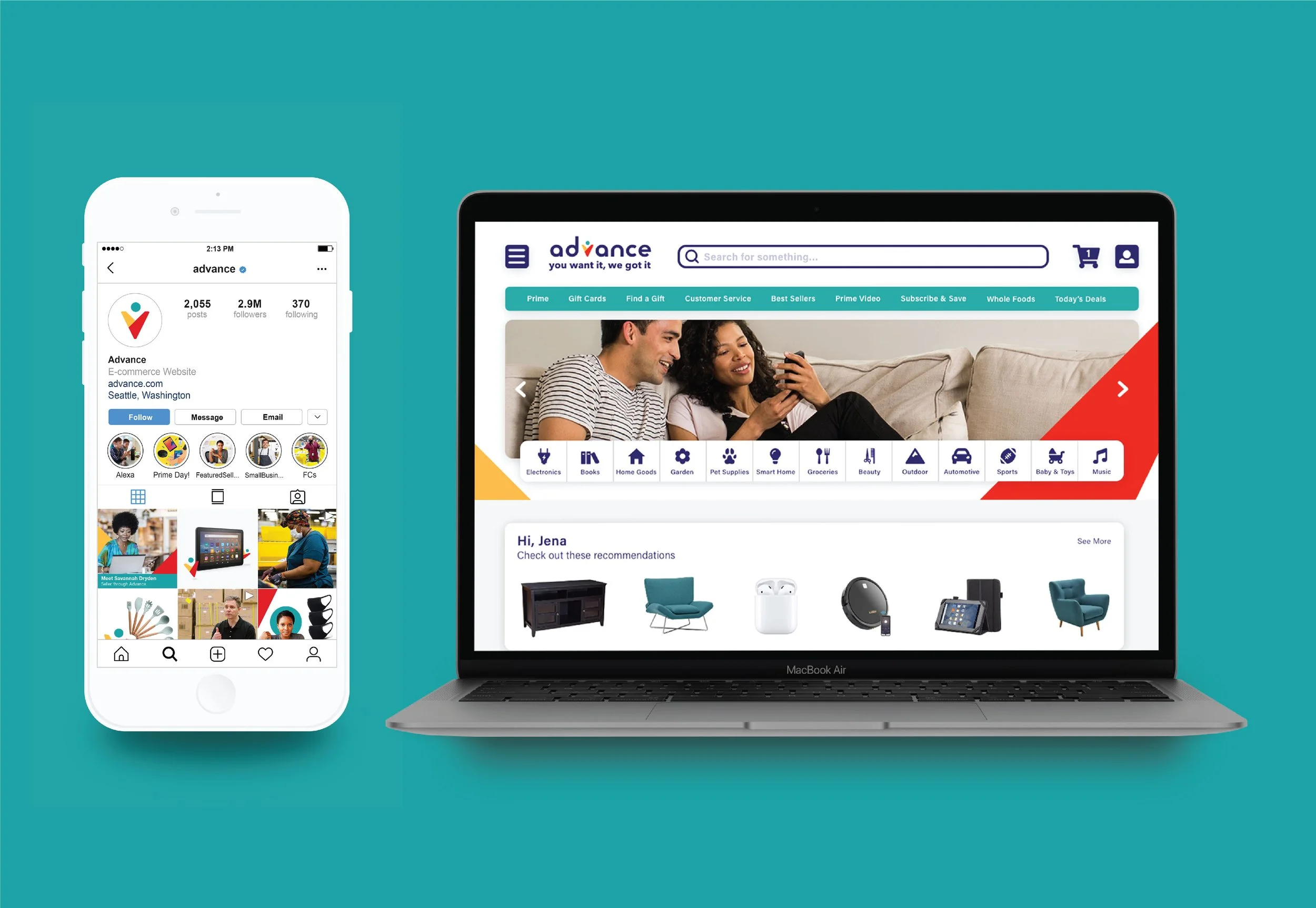
Redesigning the website was crucial because it is how customer interact with Advance most frequently. I focused on making the user experience more accessible and easier to navigate through color and icons instead of just words.
Home
Home > Electronics
Home > Electronics > Headphones
Home > Electronics > Headphones > TOZO Headphones
Print Materials


